Cannabis packaging is one of the most regulated and creatively constrained categories in design. Every label has to meet state compliance requirements. Every visual has to work hard enough to stand out on a shelf full of competitors doing the same thing. Getting both right at the same time takes real discipline.
This is a collection of work built inside that tension across multiple clients, multiple product categories, and multiple markets.
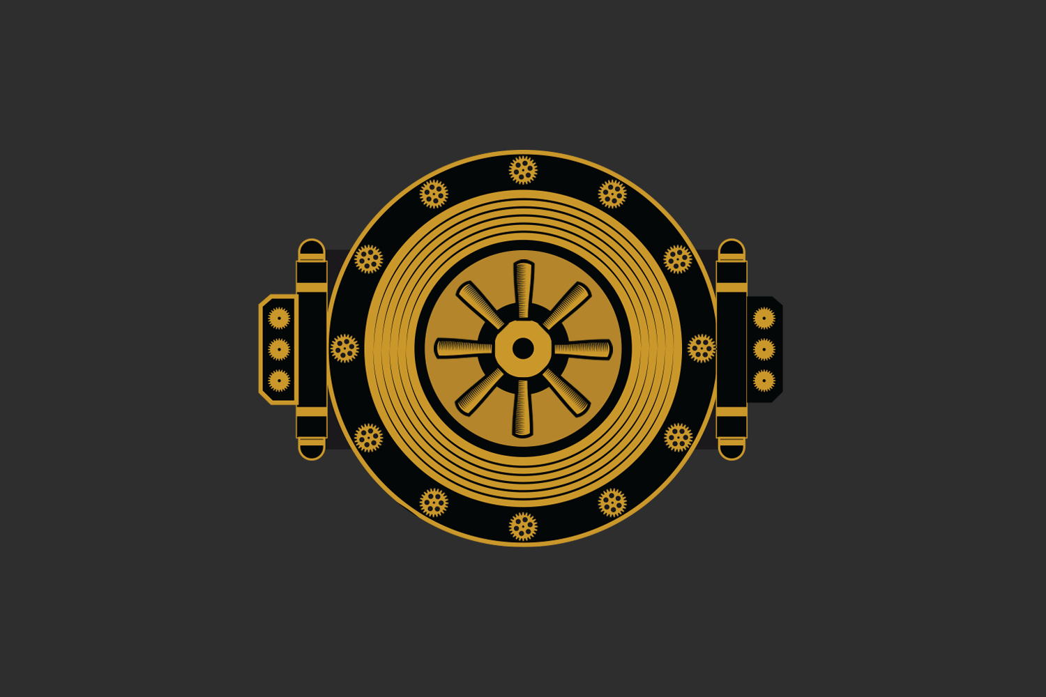
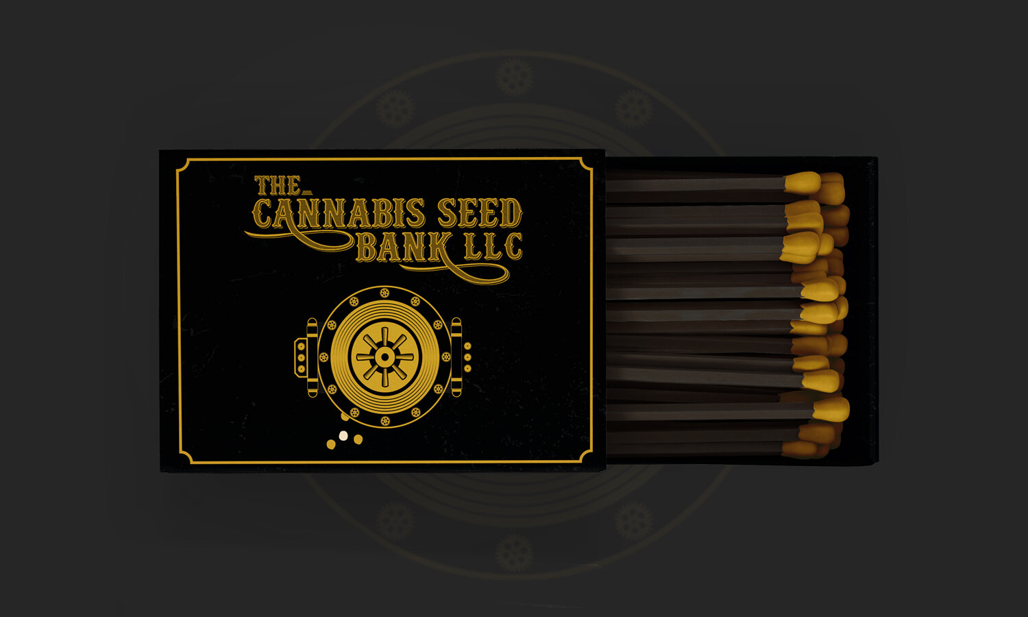
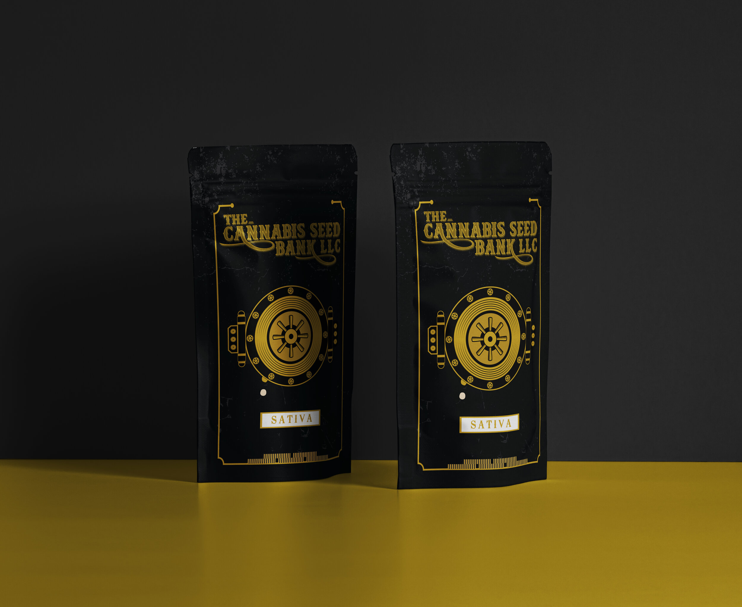
Cannabis Seed Bank
Packaging Design

The brief was clear: design packaging that visually communicates a bank vault holding cannabis seeds. Conceptually direct, executionally interesting. We leaned into the graphic possibilities and built something ownable, with character that stands out on shelf.

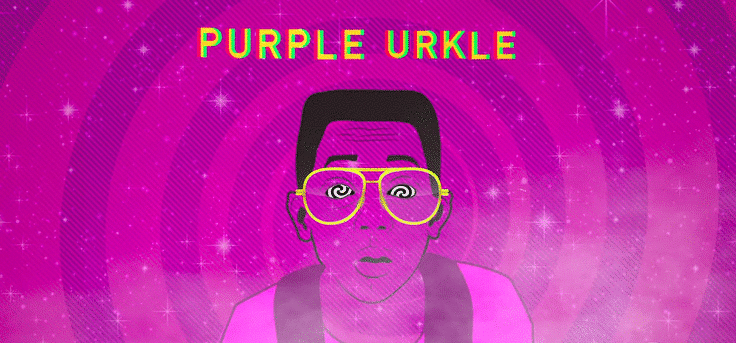
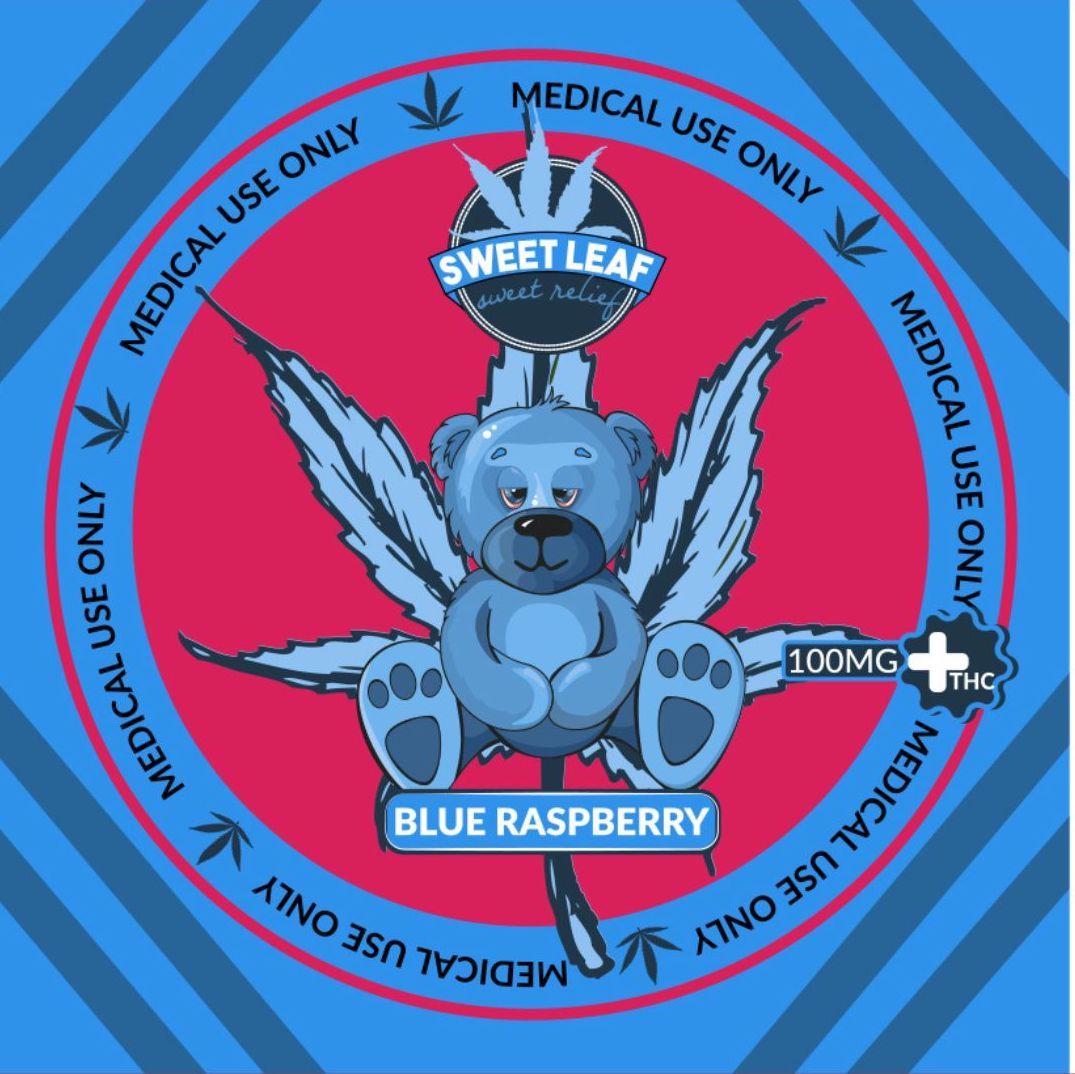
Purple Urkle
Illustration and Graphic Design

Built around the Purple Urkle strain and its visual universe. An exercise in character, color, and motion. Pure illustration, no brief, no client. Just the work.

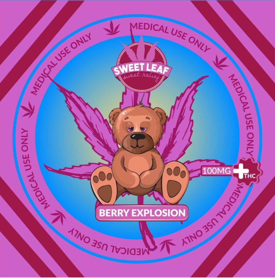
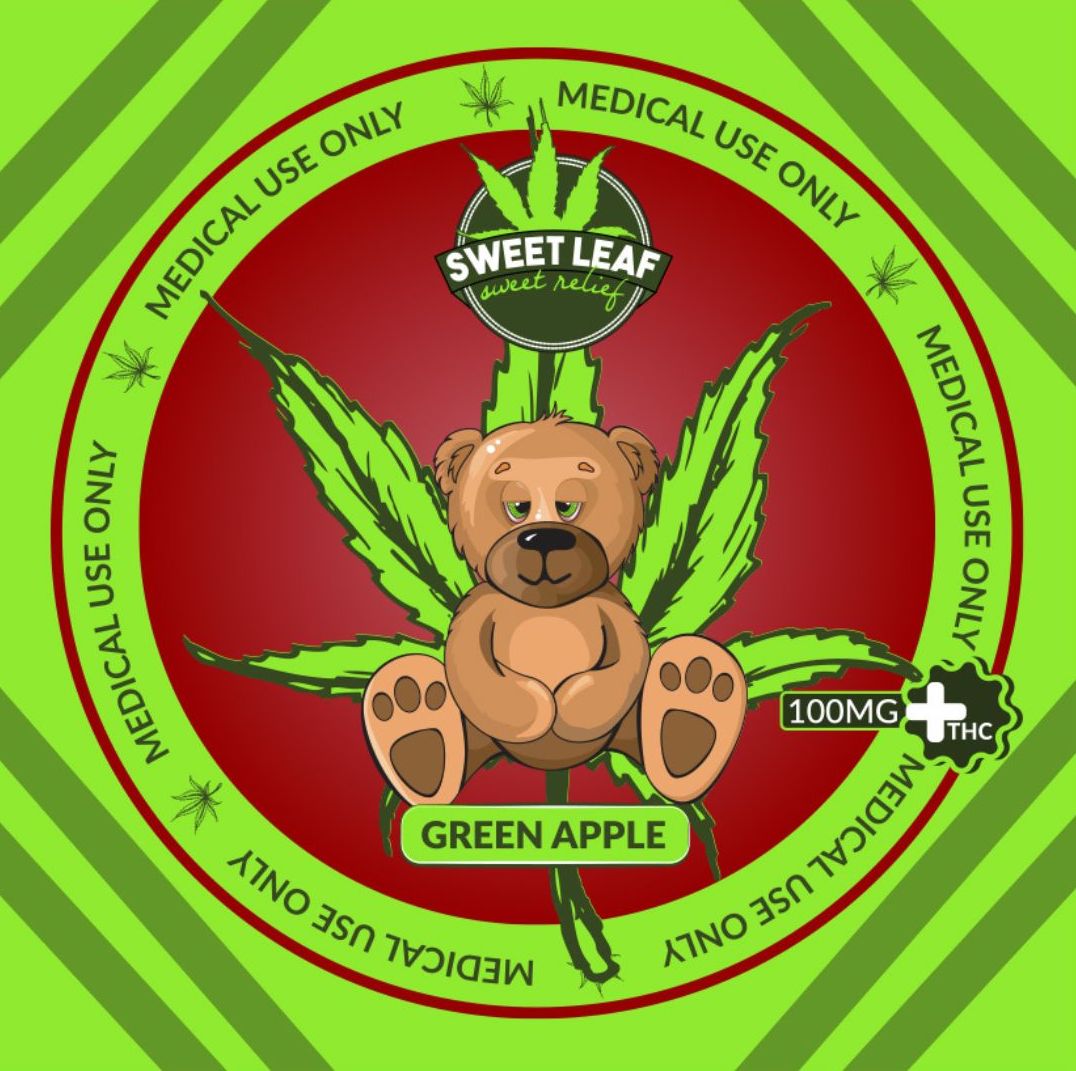
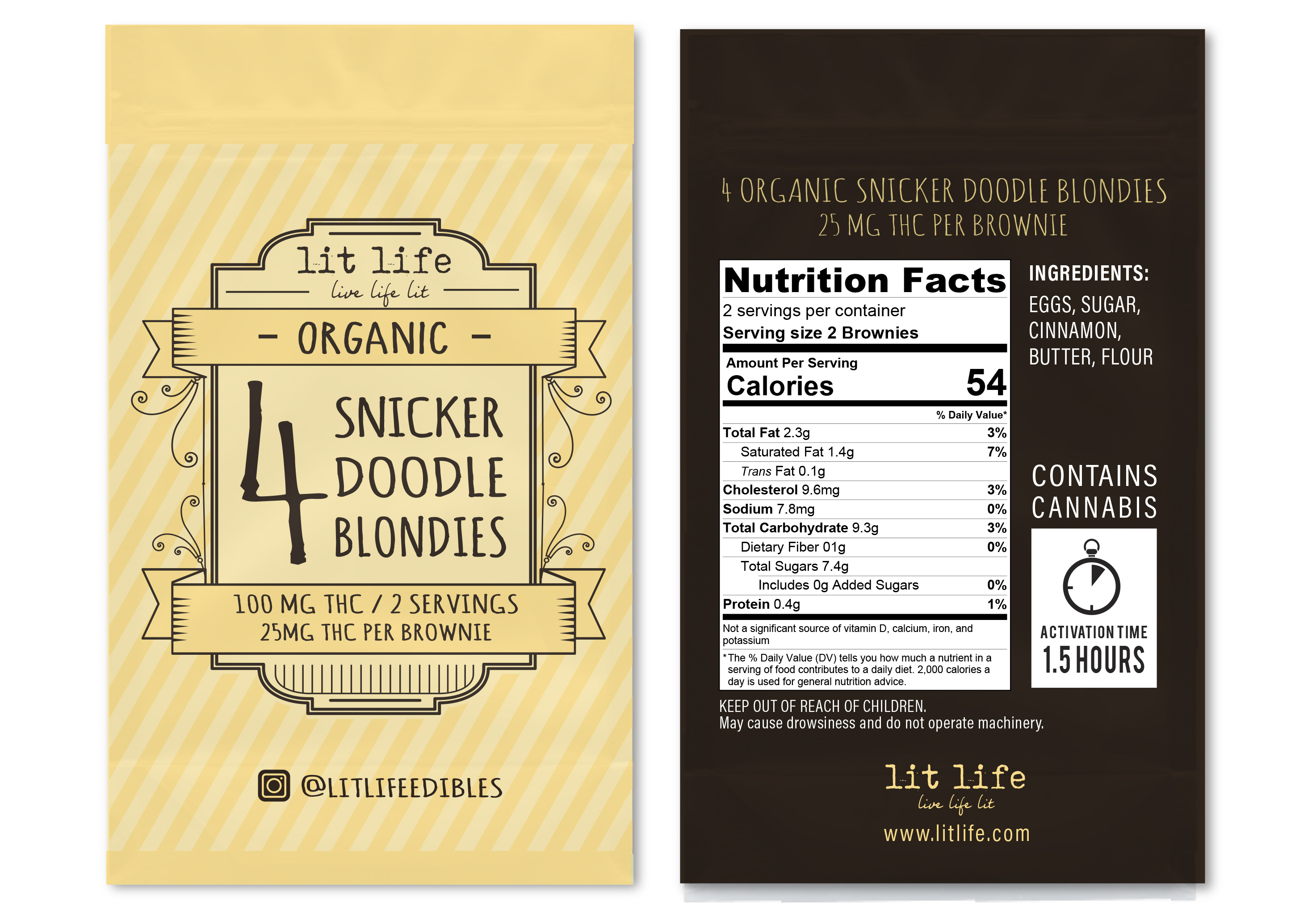
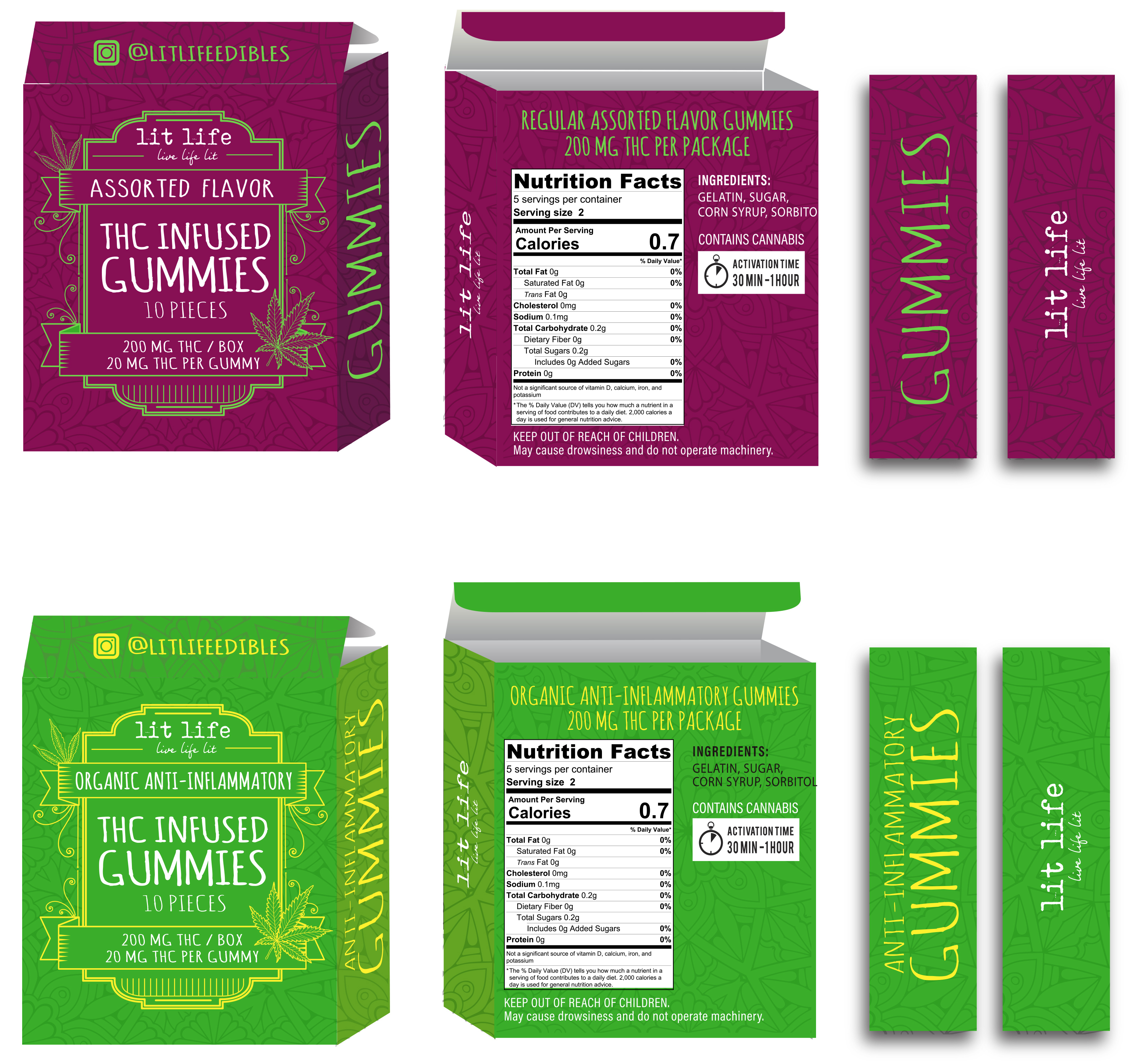
Marijuana Packaging
Packaging and Compliance
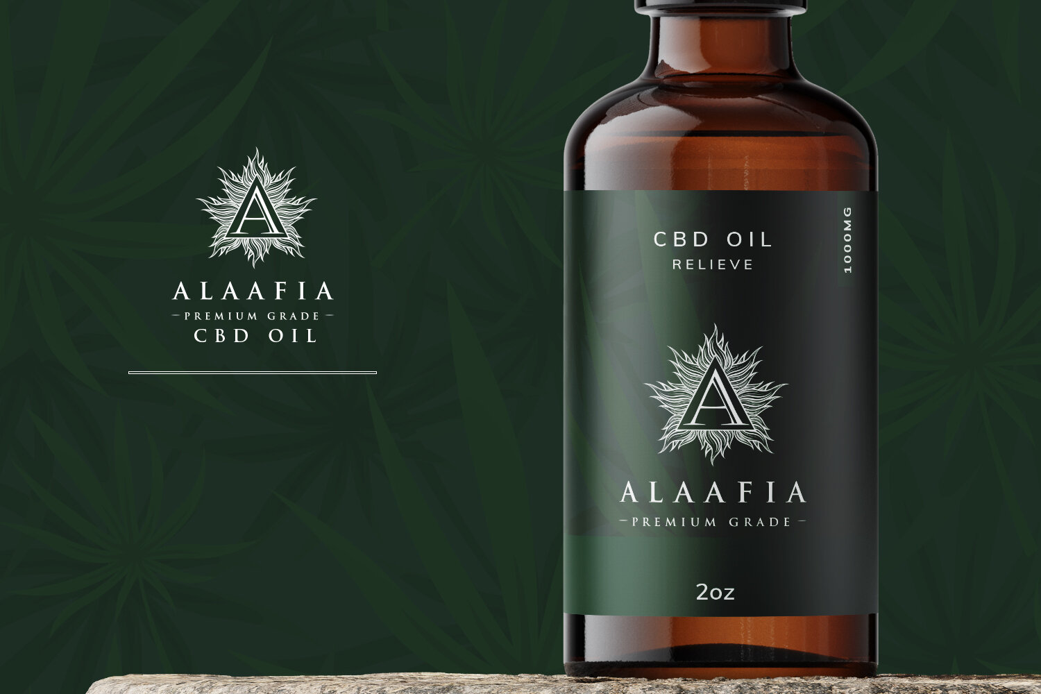
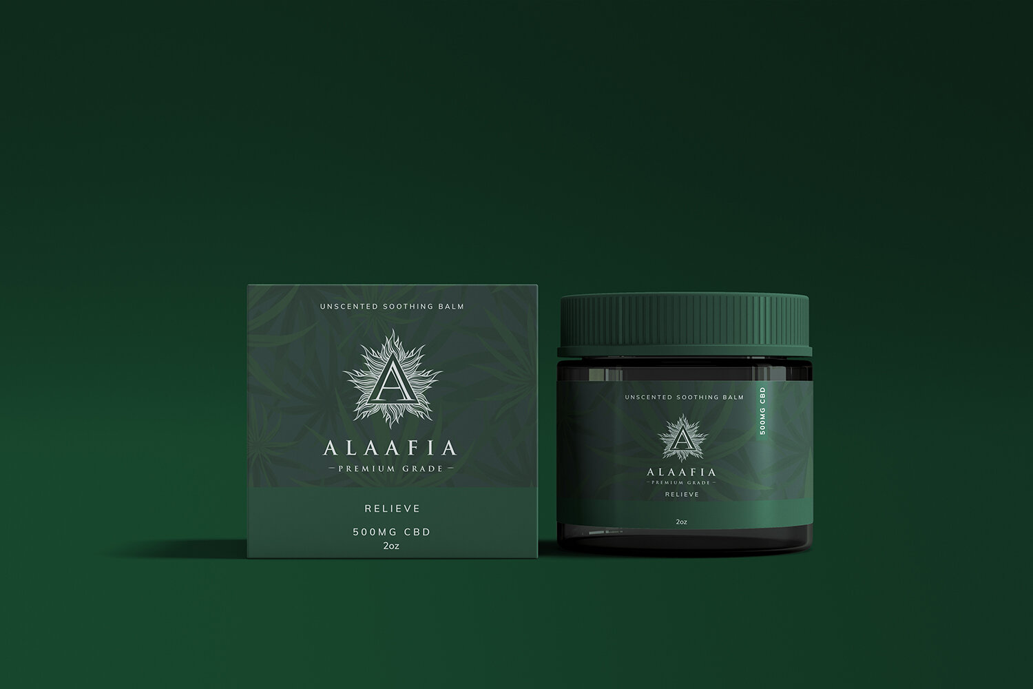
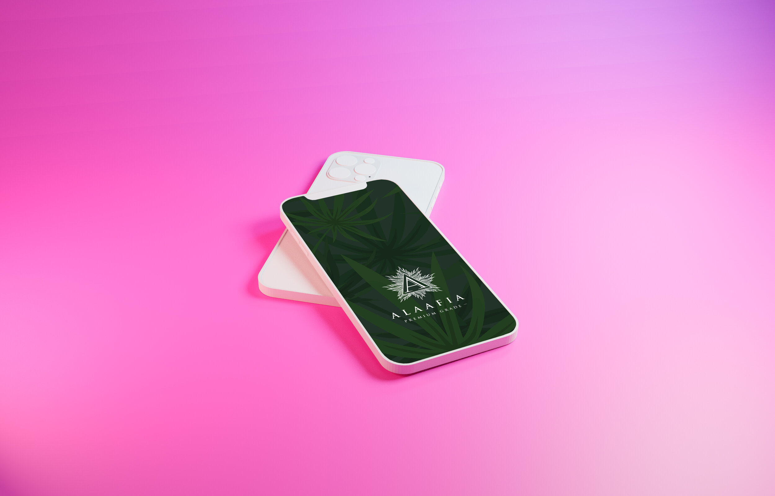
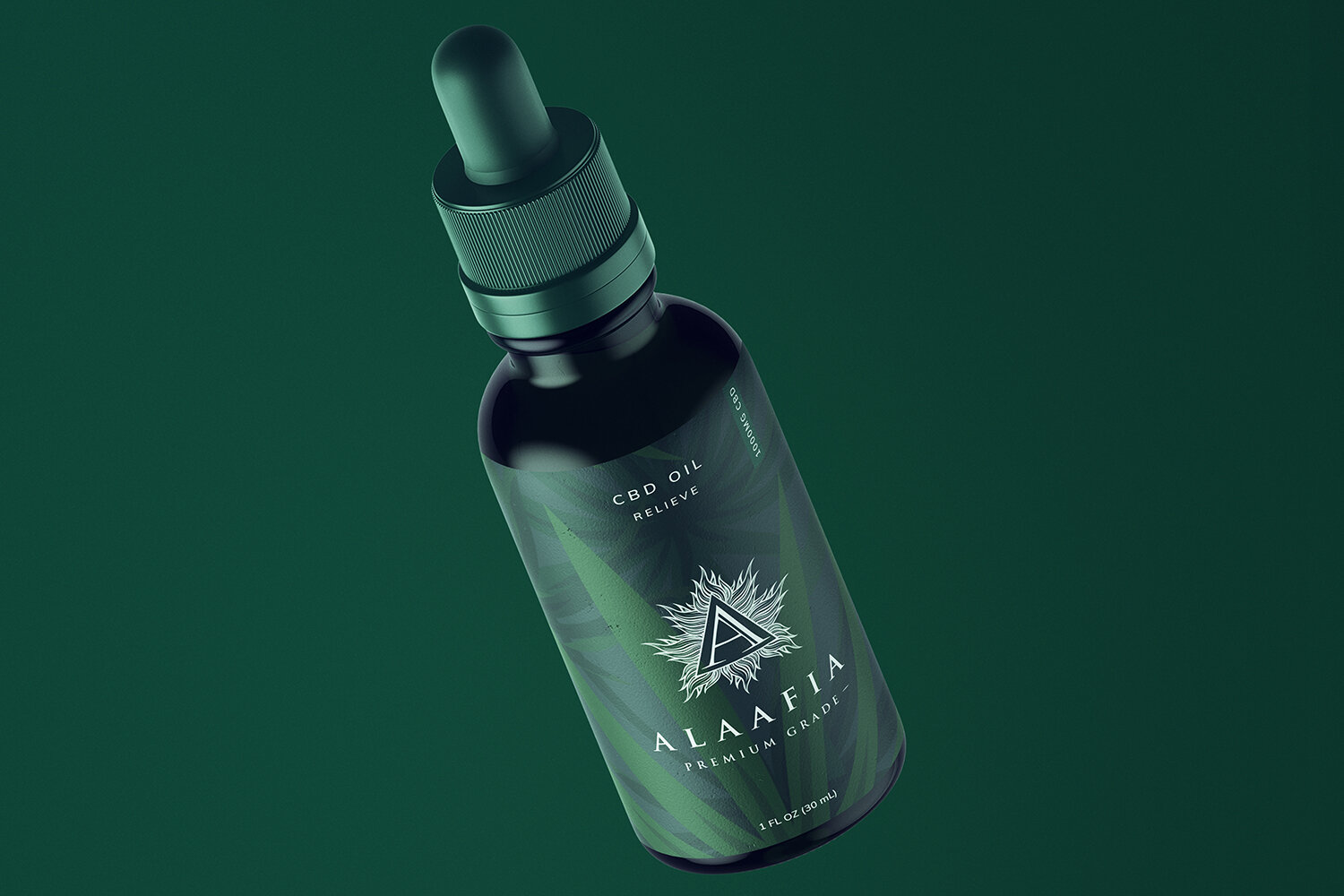
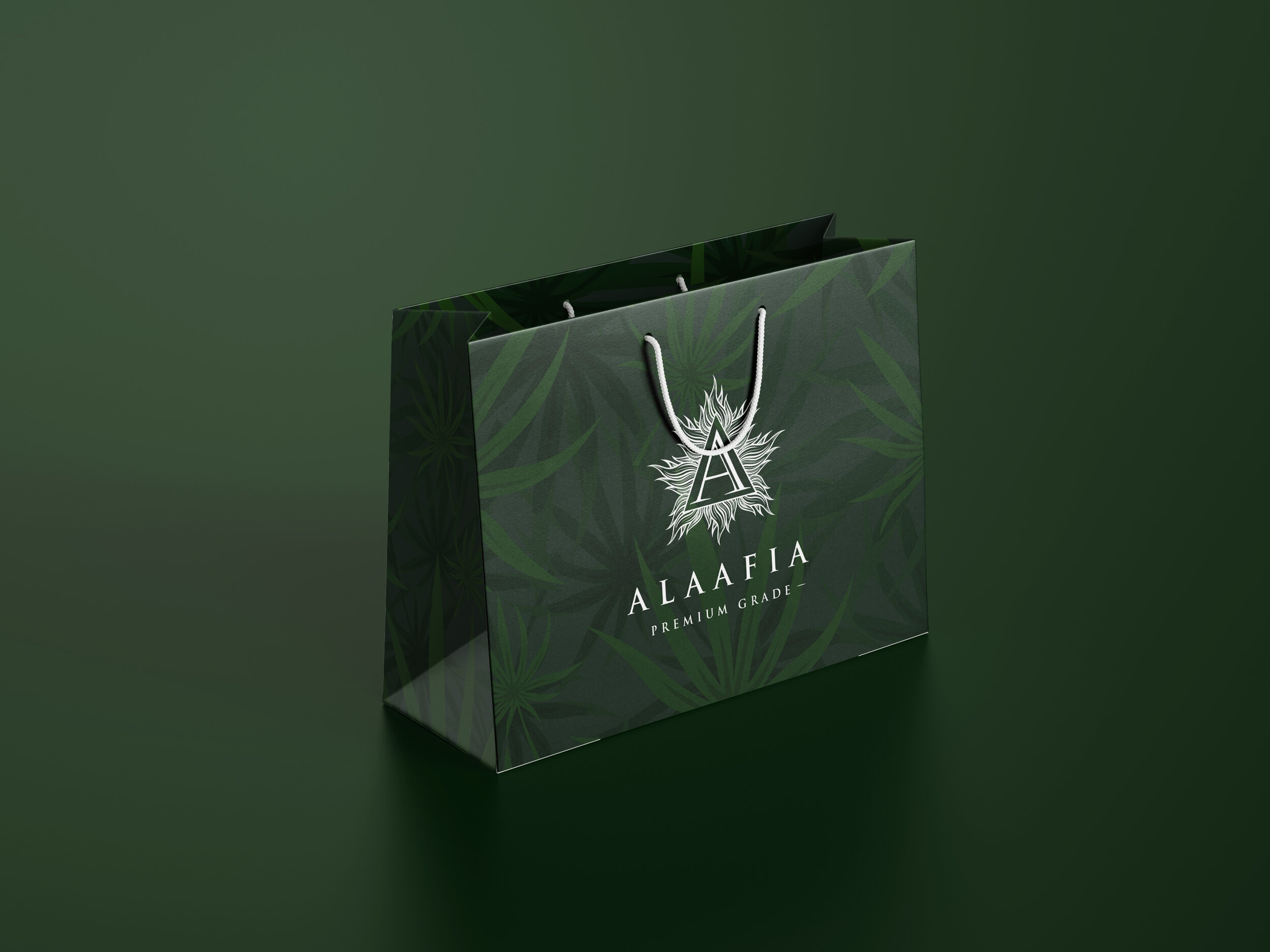
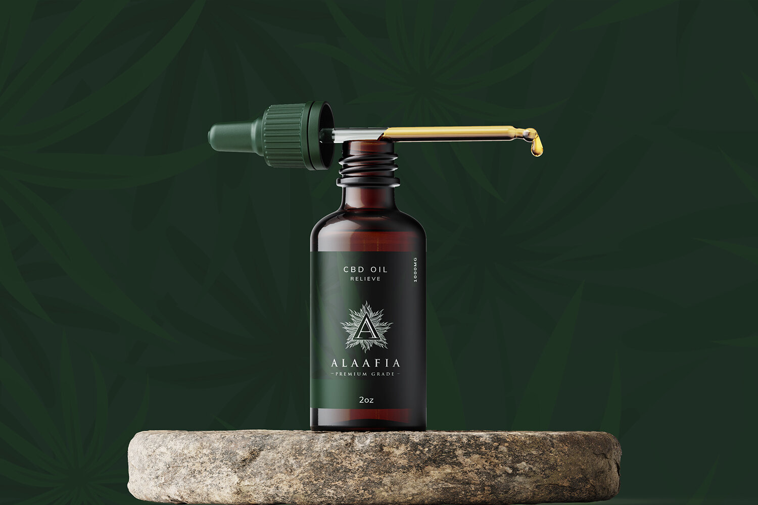
Alaafia
Brand Identity and Packaging
Alaafia is a Yoruba word. It translates loosely to peace, good health, wellness, and prosperity.
The brand identity was built to carry that weight.
From the logo to the product packaging, every touchpoint had to feel intentional, grounded, and true to what the name actually means.
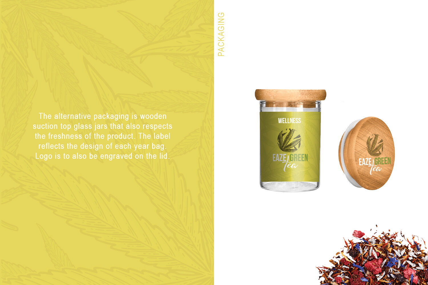
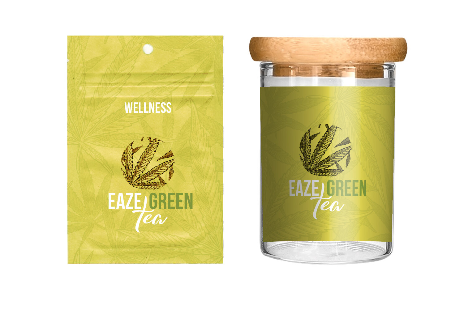
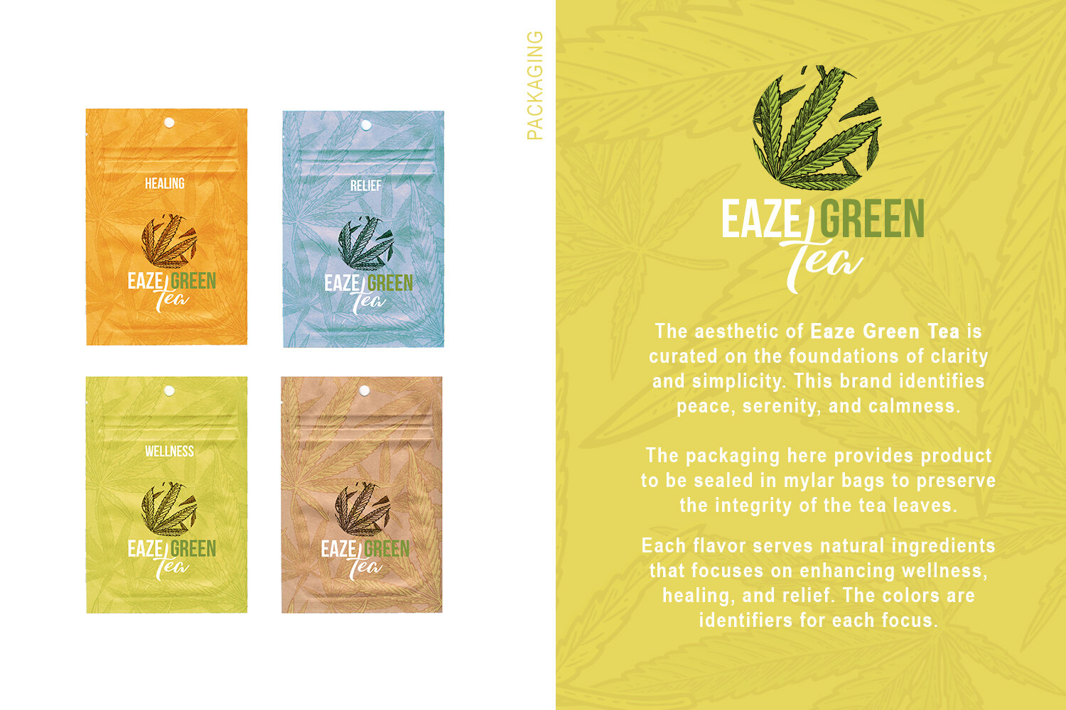
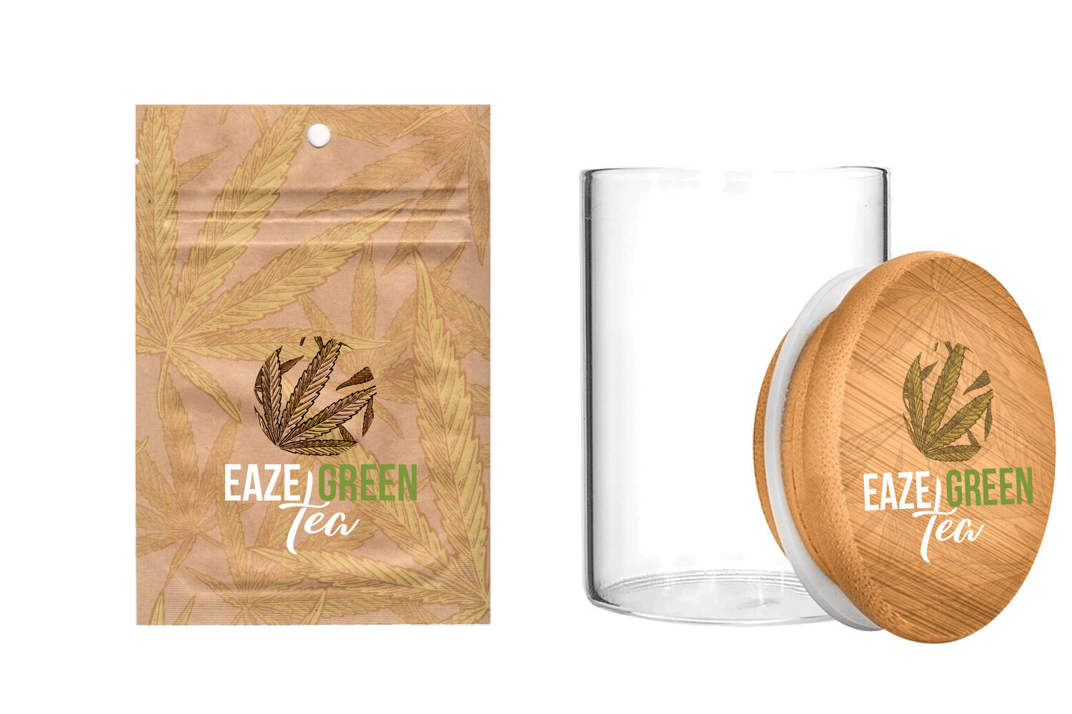
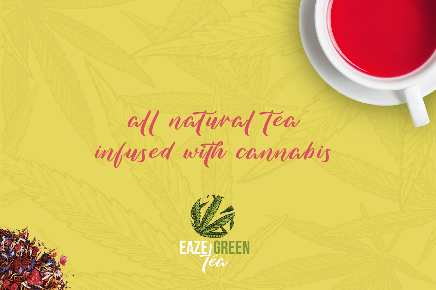
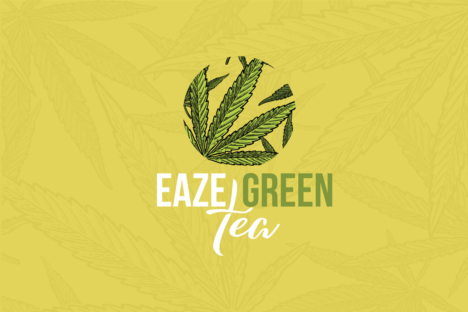
Eaze Green Tea
Packaging and Brand Design
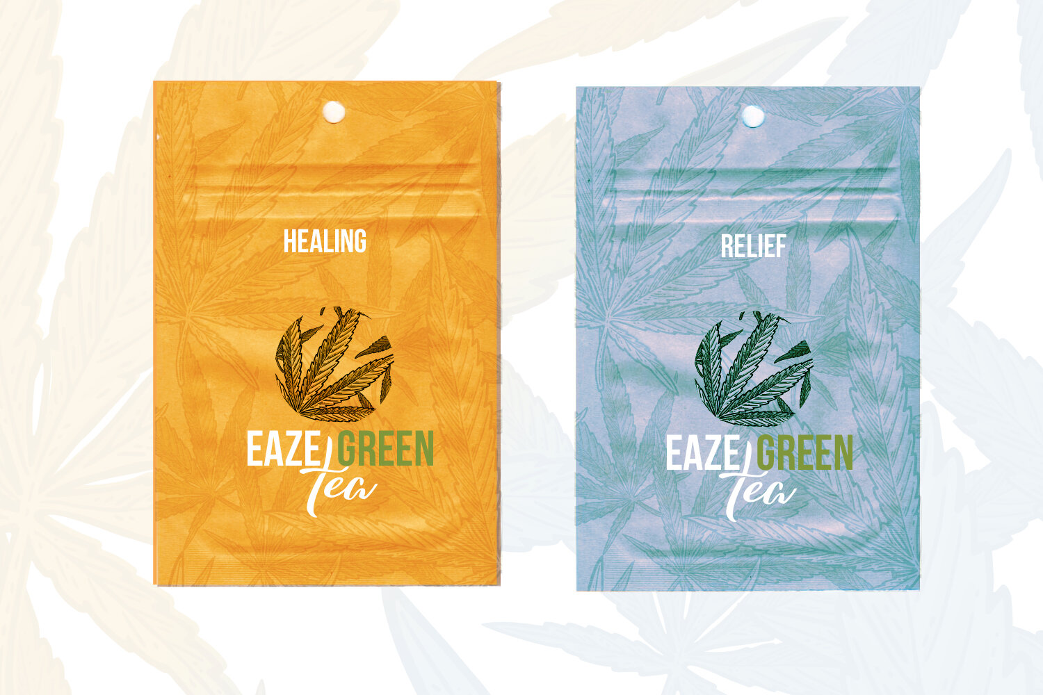
Eaze Green Tea is built on clarity and simplicity. The brand speaks to peace, serenity, and calmness and the packaging had to carry all of that before a word was read. Product is sealed in mylar bags to preserve the integrity of the tea leaves. Each flavor is color-coded to its focus: wellness, healing, relief. Simple system. Immediately legible on shelf.
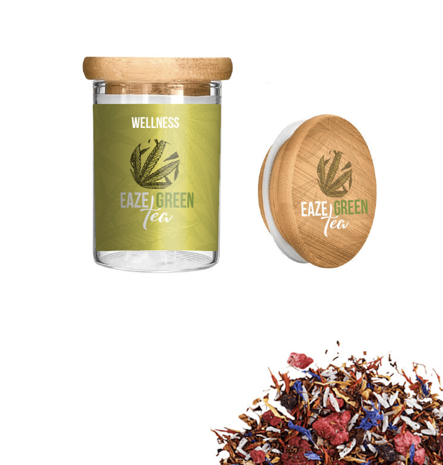
A wellness brand lives or dies on trust. The visual language has to feel clean enough to earn it immediately. No clutter, no noise. Just the product, the intention behind it, and the design that connects the two.
The color system is the backbone of the line. Each flavor gets its own color identifier so a customer can navigate the range at a glance. Simple, intuitive, and consistent across every format we touched.
The product itself is thoughtful. Each tea is sealed in mylar bags to protect the integrity of the leaves. Each flavor is built around a specific wellness intention....healing, relief, relaxation and the colors do the work of communicating that before the copy has a chance to. Our job was to make sure the packaging honored all of that without overcomplicating it.
We designed across multiple packaging substrates. The mylar bags required a different approach than the jars. The logo had to hold up in both contexts without losing its character. That kind of flexibility is not always easy to build in but it is what makes a brand feel cohesive when the product line grows.